ECHO
Charity branding and website
Early in 2016 we were invited to pitch for a re-brand of the Evelina Children’s Heart Organisation (ECHO). After winning the pitch, we were asked to work closely with their team to re-imagine the ECHO logo and branding, trying to bring out the essence of what the charity means to its members.
Their original strapline of “Support for families of heart-children treated at The Evelina Children’s Hospital” was a bit of a mouthful, and it was felt that it didn’t accurately do justice to what ECHO was aiming to achieve. A new strapline of “Connecting the Children’s Heart Community” gave the charity and its members a more focused idea of how ECHO supports the families of heart children.
This thought was also translated into the new logo and “ribbon” design which can be used on all marketing collateral in the future to provide a unifying and original look for ECHO.
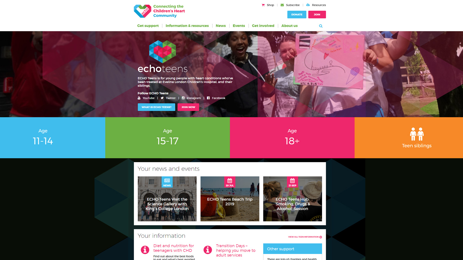
In addition to this, we were also tasked with redesigning their sub-brand “ETC – ECHO Teen Club” (now called “ECHO Teens”) to feel more modern and inclusive.
Considered Creative have been a pleasure to work with and throughout the project it has felt like they are part of our team. Tom and Emma spent time ensuring they understood the work we do and the needs of the children and families that we support, which was essential to the success of this project. They are excellent at bringing ideas into a visual reality, and we are very happy with the new brand, publications and animations they have produced for us. The project has been a real success and we highly recommend working with Considered.Siobhan Morton – ECHO
A CGI mascot
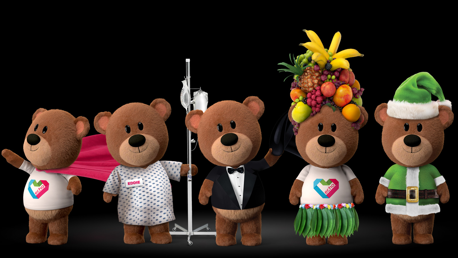
Their mascot “Eddie the ECHO Bear” was re-imagined in high-end CGI to use on printed material and online.

A new website
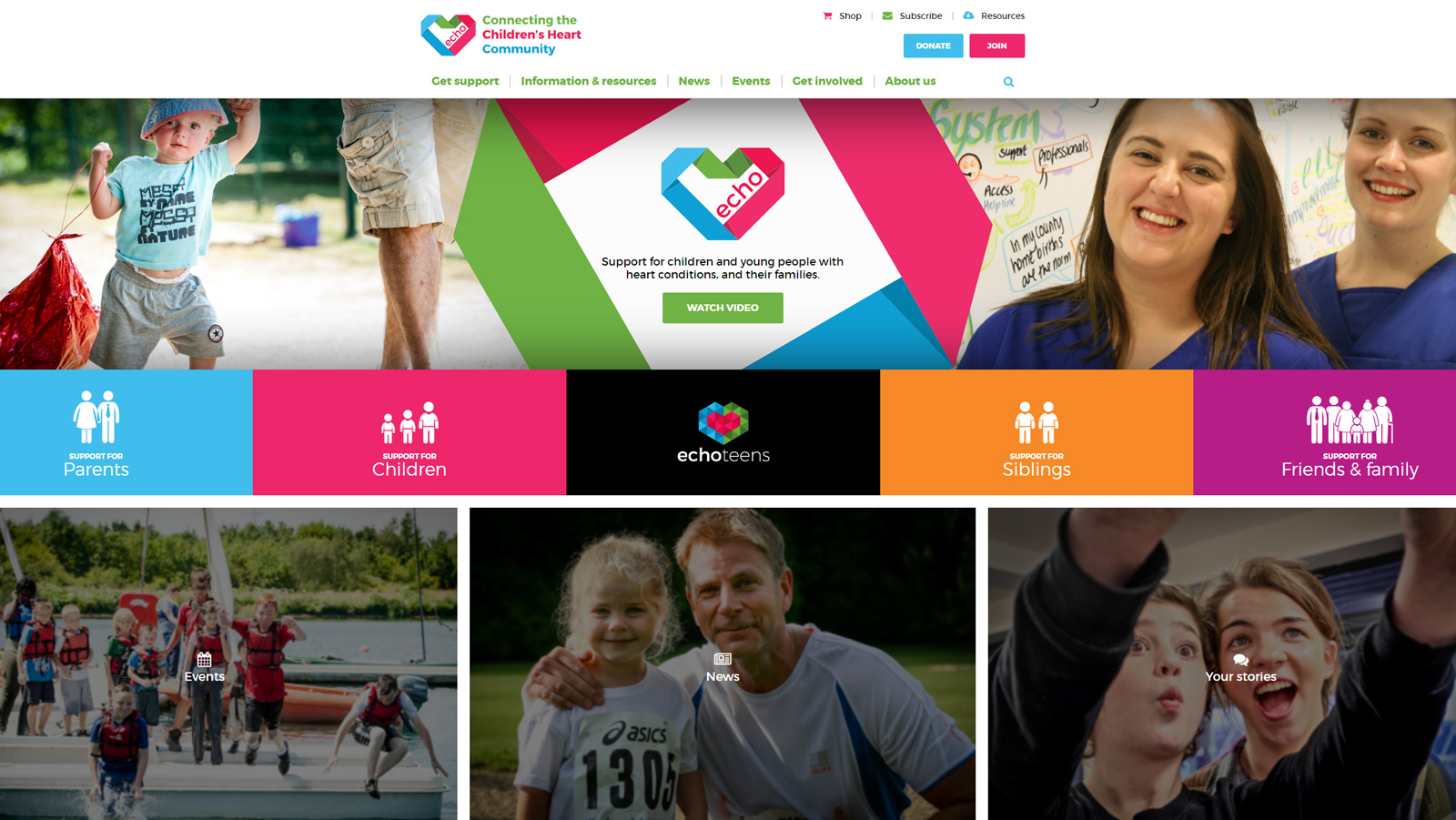
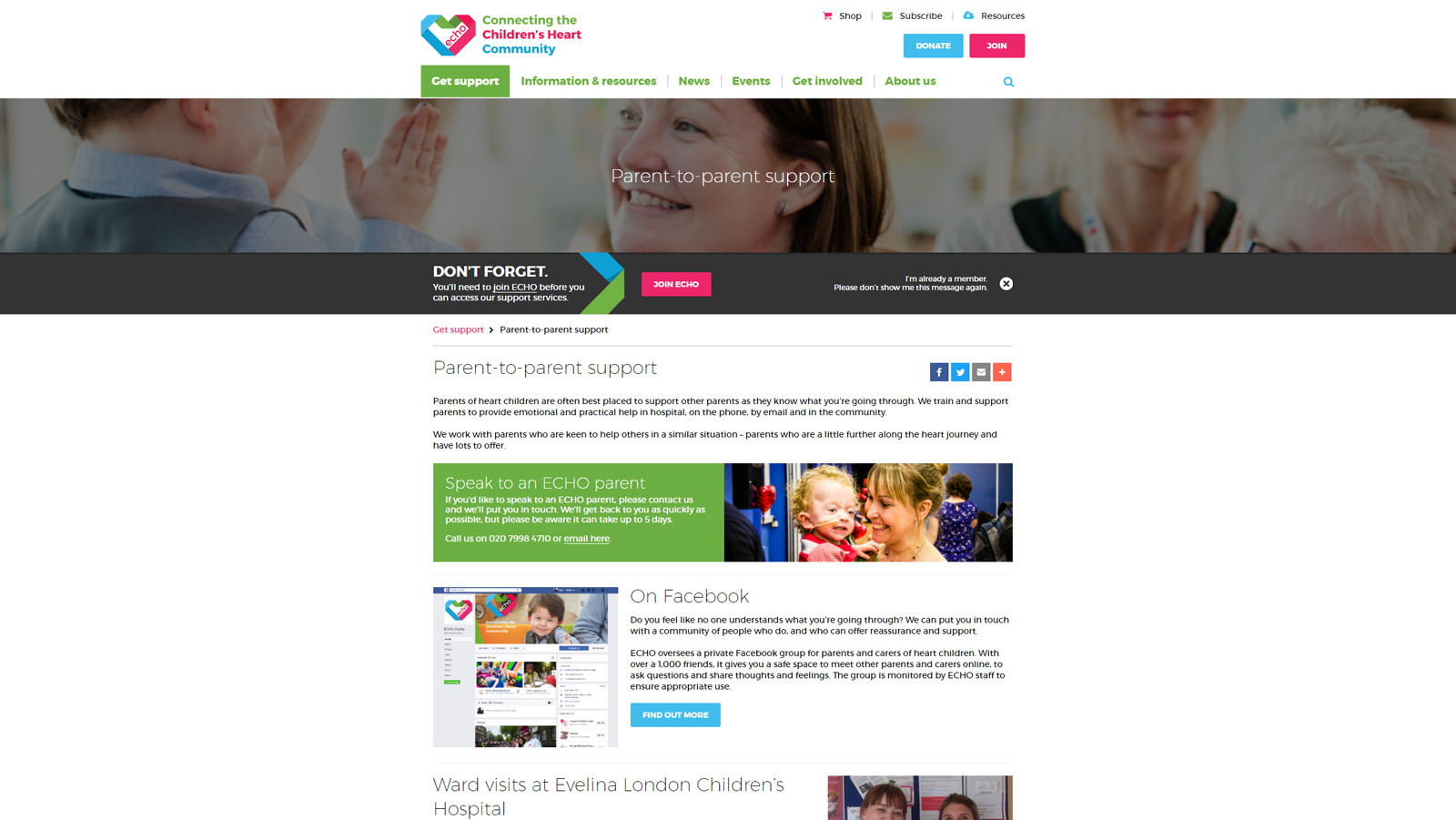
We worked with ECHO to create a new brand, communications and website. They have a vast amount of information and resources for those affected by CHD and we needed to find simple, intuitive ways of presenting that content on the website without it becoming confusing or insurmountable for users.


Collating and inputting the content (much of which needed to be re-written) has taken the bulk of the time. The relatively small team at ECHO had their work cut out for them, and we have offered help and expertise along the way to make the transition to the new website as easy and painless as possible for them.
The new website is fully responsive and shows off their new clean and bright branding brilliantly.
